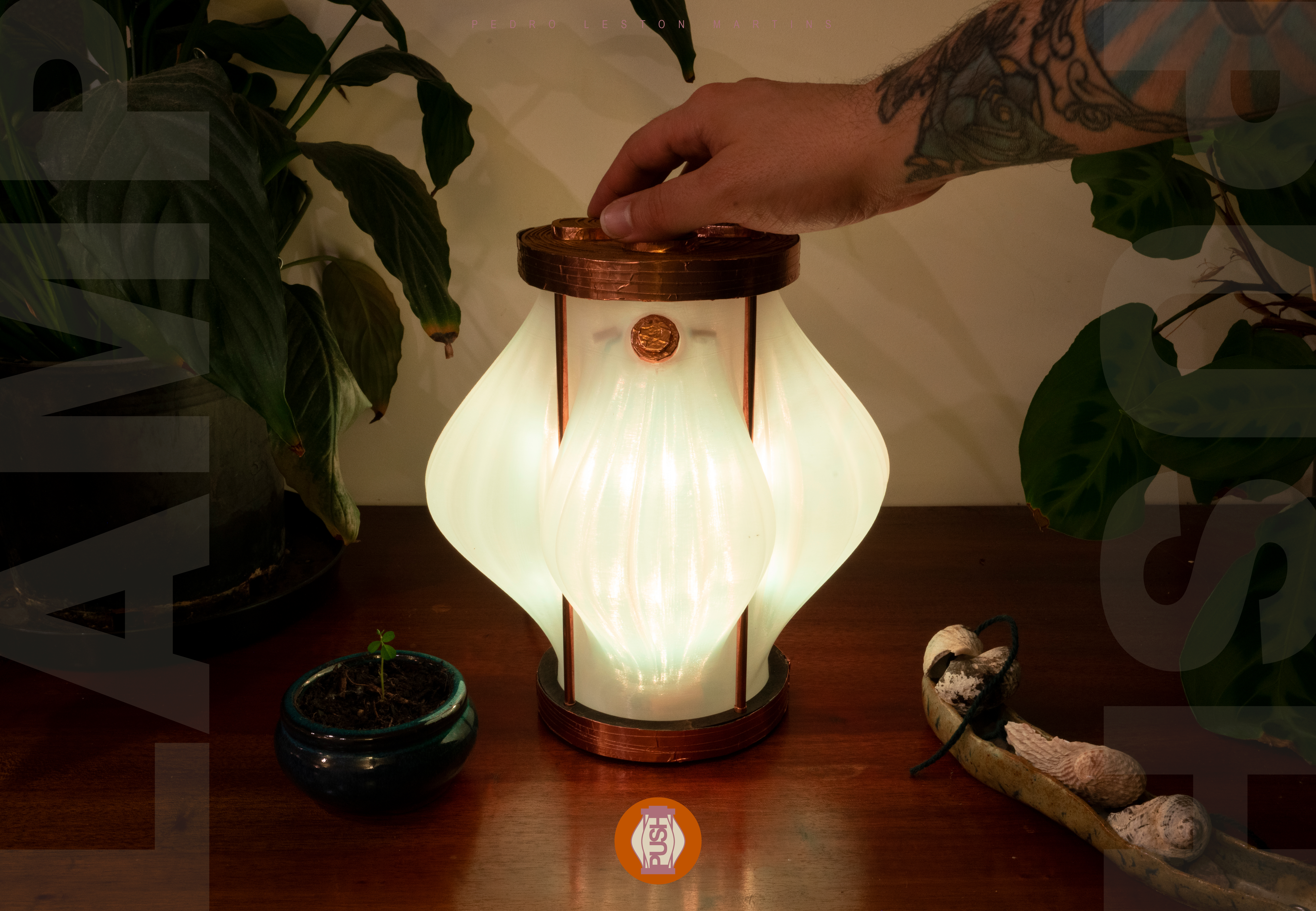
PUSH explores the relationship between modularity, interaction and material expression through a stackable lighting design. Inspired by the layered forms of vertebrae, clouds and waves, the lamp uses rotating segments to adjust light diffusion while maintaining a balance between flexibility and structural stability.
The project considers the product as a complete experience, from physical interaction and material selection to branding and packaging. Its form and visual identity are closely connected, allowing the design language to extend consistently across the lamp and its presentation.
PEDRO LESTON MARTINS
INDUSTRIAL / PRODUCT / COMPUTATIONAL DESIGN
PUSH
PRODUCT DESIGNPUSH Modular Lamp
Product Design / Lighting Design / Prototyping / Visual Identity
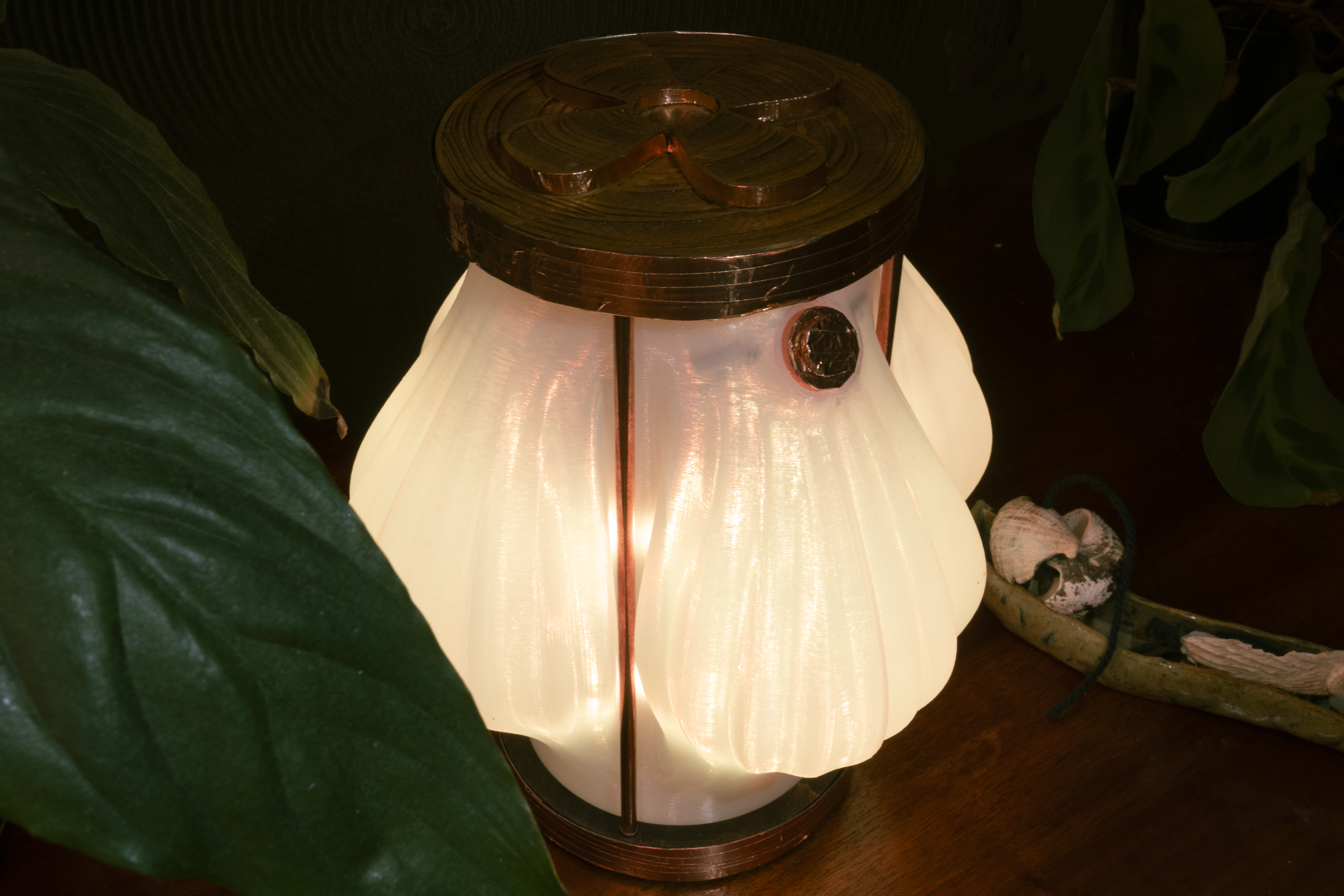
PUSH is a modular, stackable lamp inspired by vertebrae, clouds and waves. Designed around adjustable light diffusion and material contrast, the lamp combines a translucent PLA shade with a laser-cut MDF structure, later refined with copper tape detailing. The development process involved iterative prototyping, experimenting with AI-generated patterns and refining the controls for more intuitive interaction. The project extends beyond the physical product into logo and packaging design, creating a cohesive visual identity inspired by the lamp's form, materials and lighting effects.
Product Design / Lighting Design / Prototyping / Visual Identity
PUSH is a modular, stackable lamp inspired by vertebrae, clouds and waves. Designed around adjustable light diffusion and material contrast, the lamp combines a translucent PLA shade with a laser-cut MDF structure, later refined with copper tape detailing. The development process involved iterative prototyping, experimenting with AI-generated patterns and refining the controls for more intuitive interaction. The project extends beyond the physical product into logo and packaging design, creating a cohesive visual identity inspired by the lamp's form, materials and lighting effects.
EXPLORING MODULAR LIGHTING
FORM REFINEMENT & MATERIAL CONTRAST
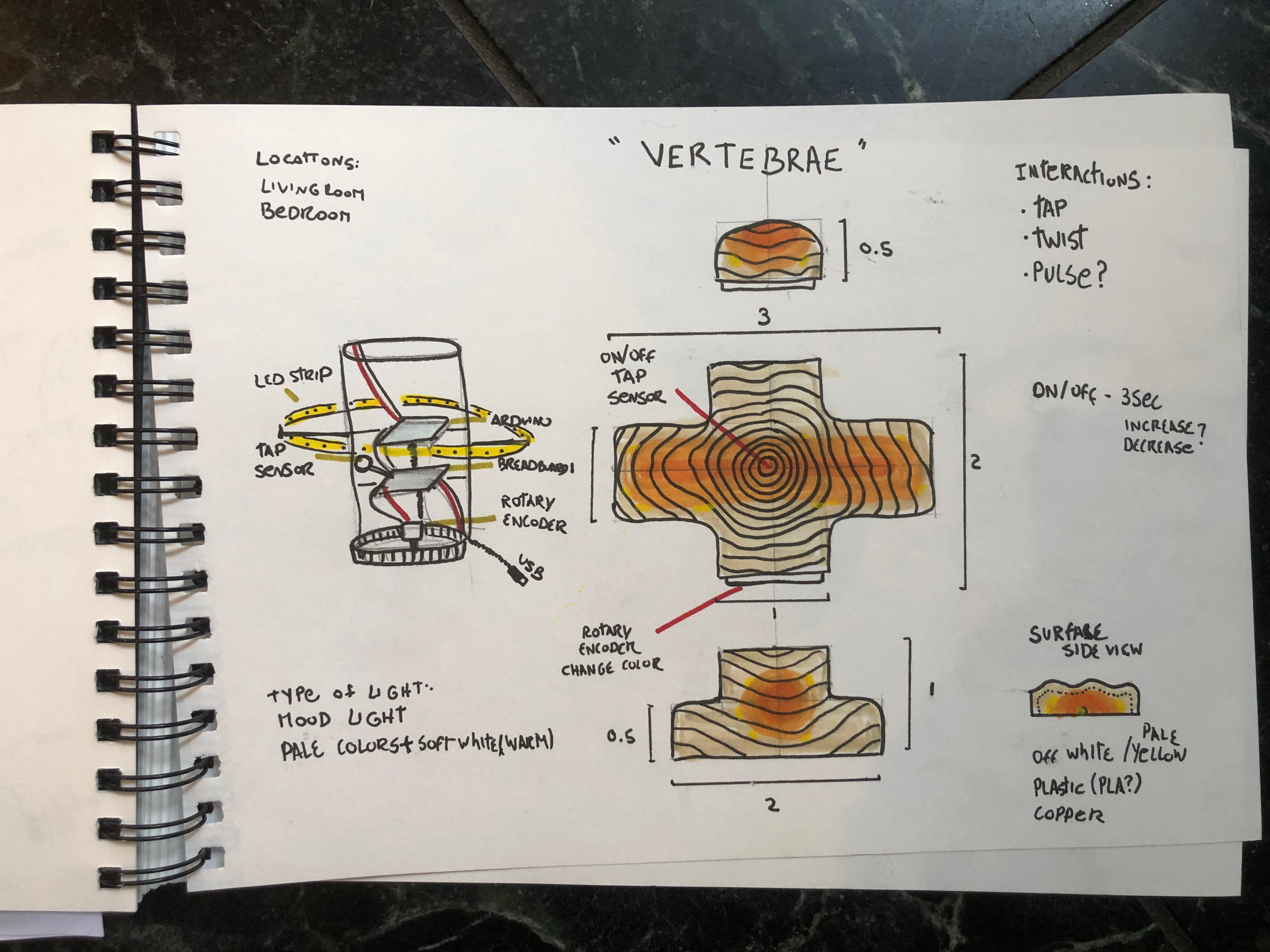
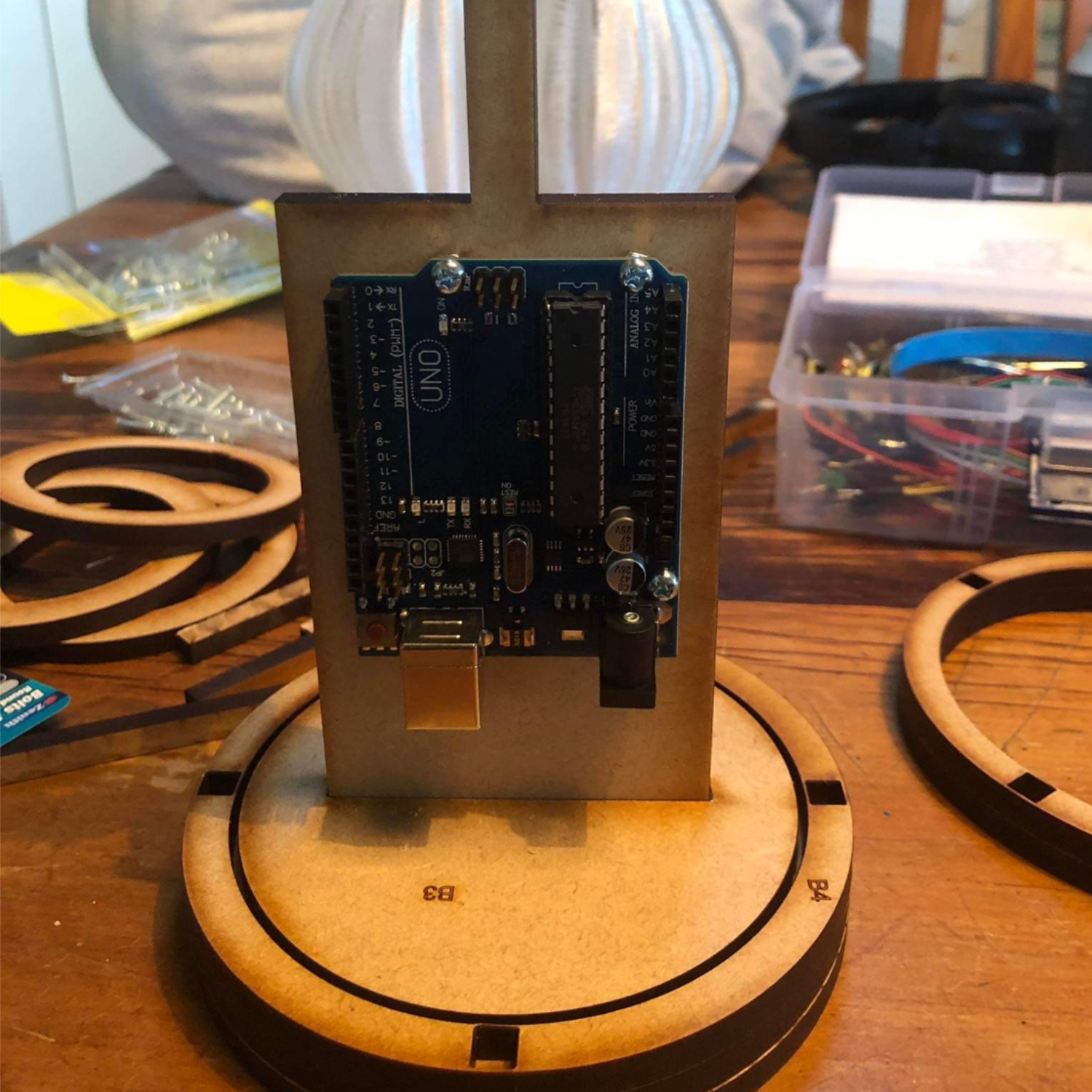
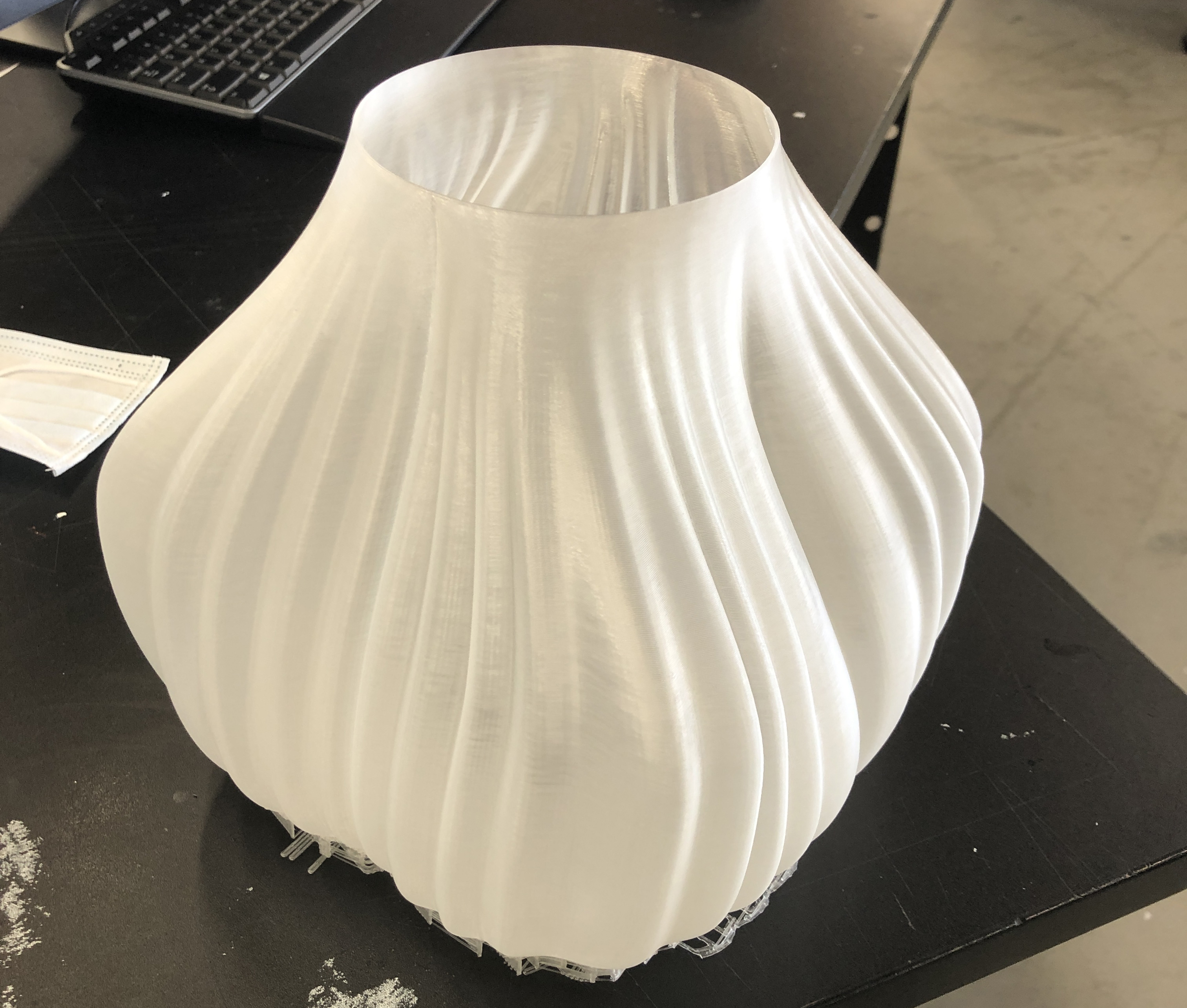
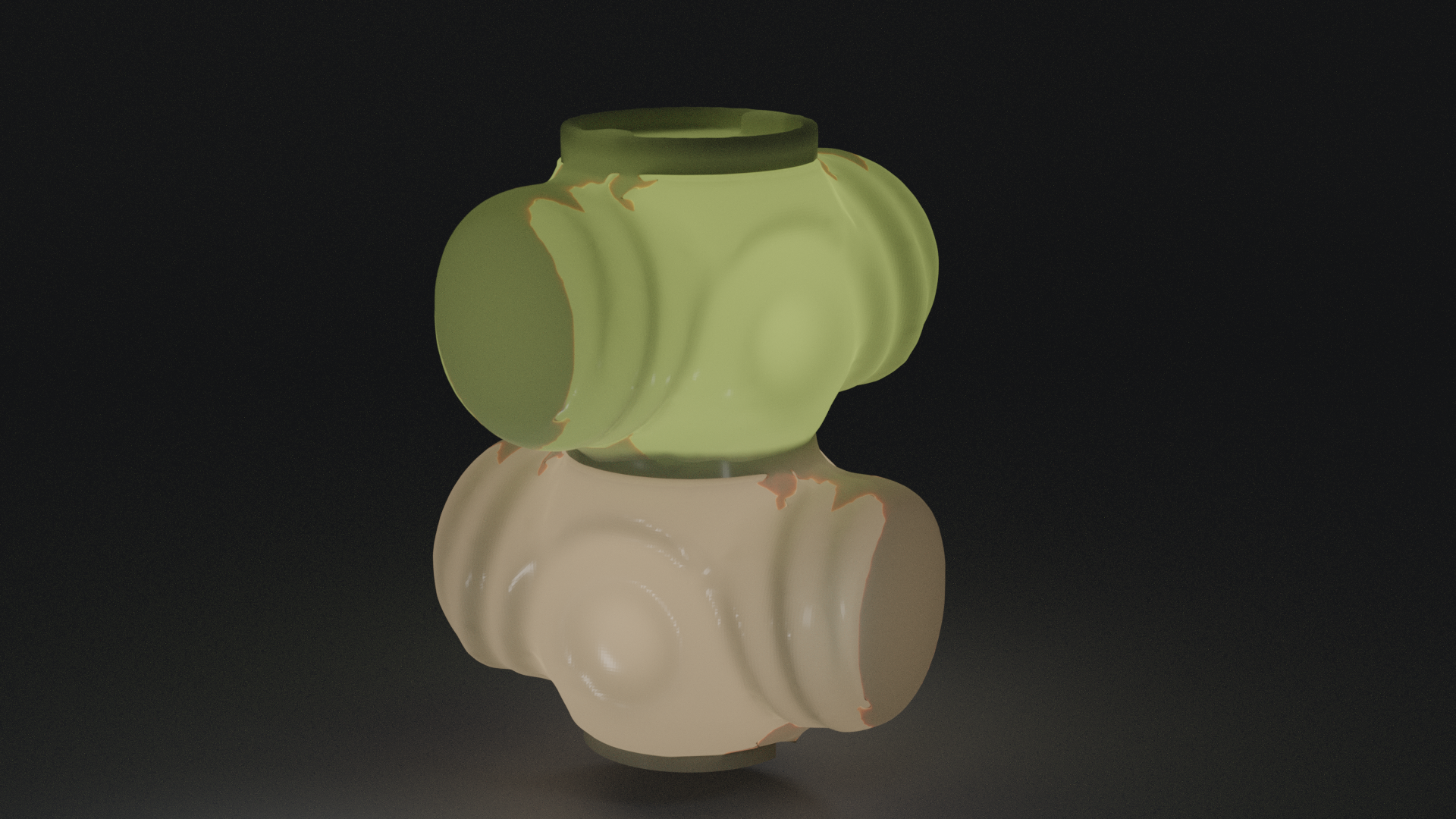
The initial design explored a fully laser-cut structure with a soft, layered silhouette. During refinement, I developed a hybrid construction using a translucent PLA shade and laser-cut MDF, creating contrast between the diffused light and the structural frame.
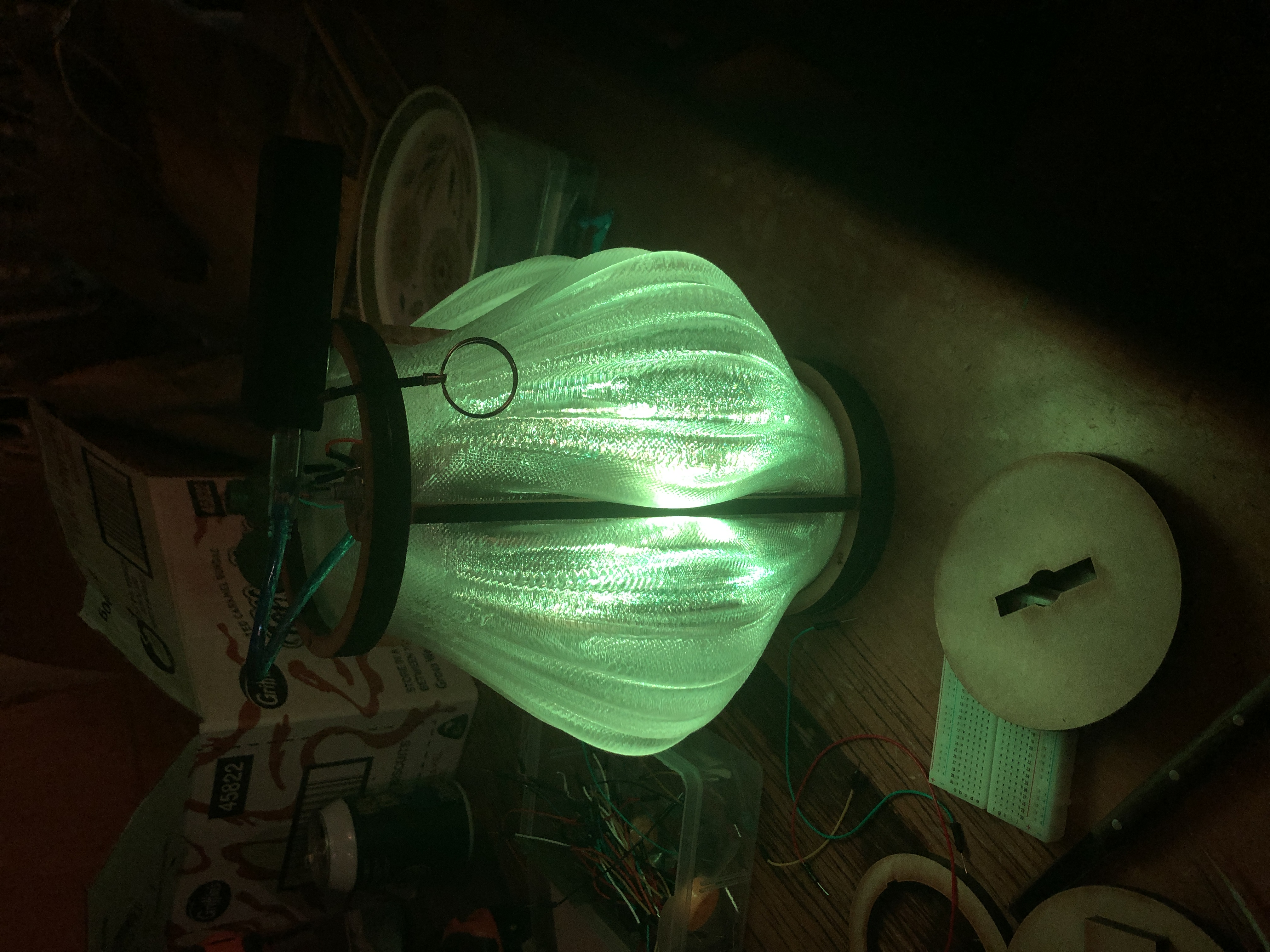
The potentiometer was repositioned from the base to the top to improve accessibility and make interaction more intuitive. I also experimented with AI-generated surface patterns, refining the selected design in Illustrator before laser cutting it. Iterative 3D printing helped resolve infill and clearance issues, leading to a simplified form, a circular switch and improved detailing around the power input.
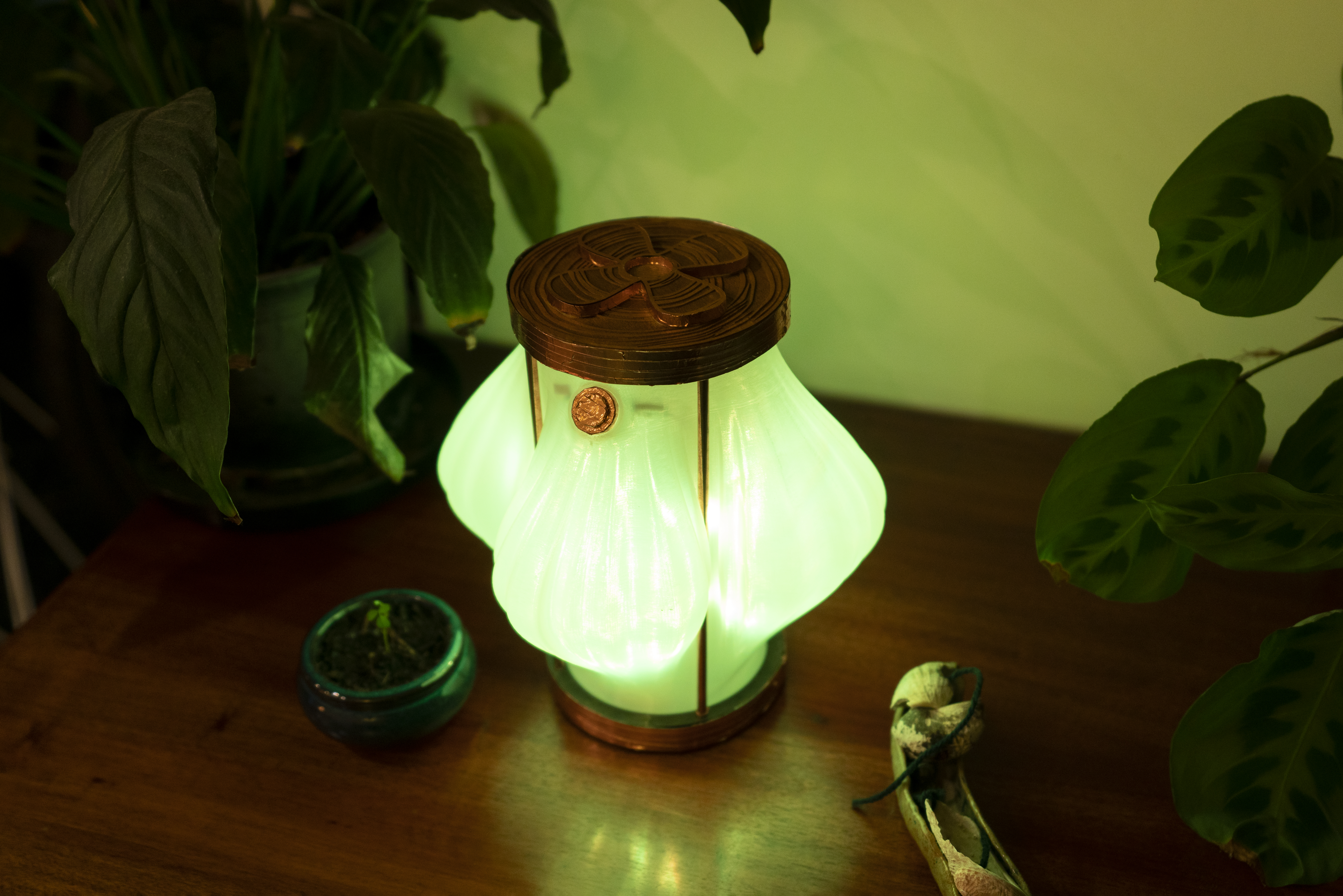
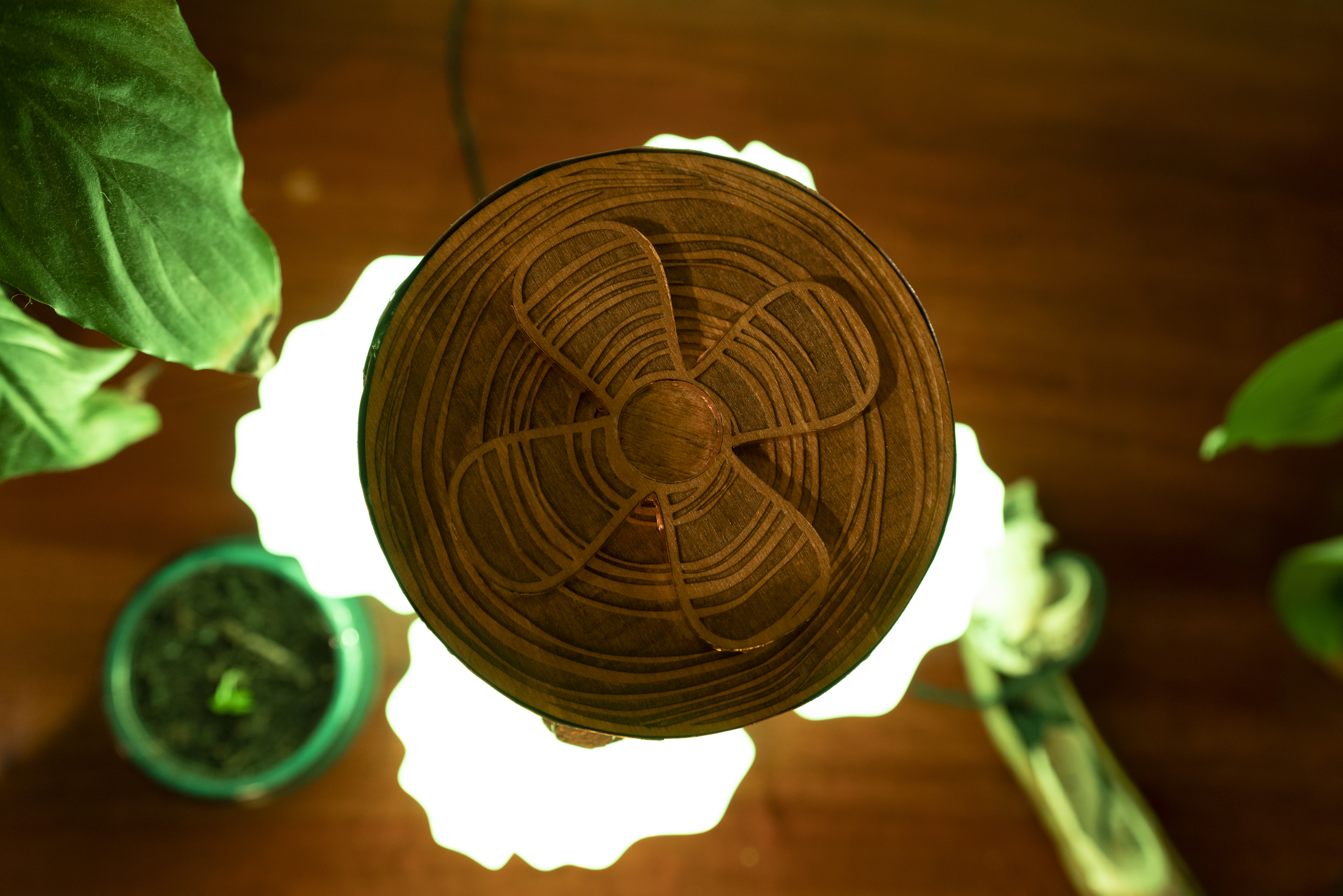
The wooden outer cage was eventually replaced with copper tape, and a cross detail was refined to complement the lamp's overall geometry.
The potentiometer was repositioned from the base to the top to improve accessibility and make interaction more intuitive. I also experimented with AI-generated surface patterns, refining the selected design in Illustrator before laser cutting it. Iterative 3D printing helped resolve infill and clearance issues, leading to a simplified form, a circular switch and improved detailing around the power input.
The wooden outer cage was eventually replaced with copper tape, and a cross detail was refined to complement the lamp's overall geometry.
PROTOTYPING, BRANDING & PHOTOGRAPHY
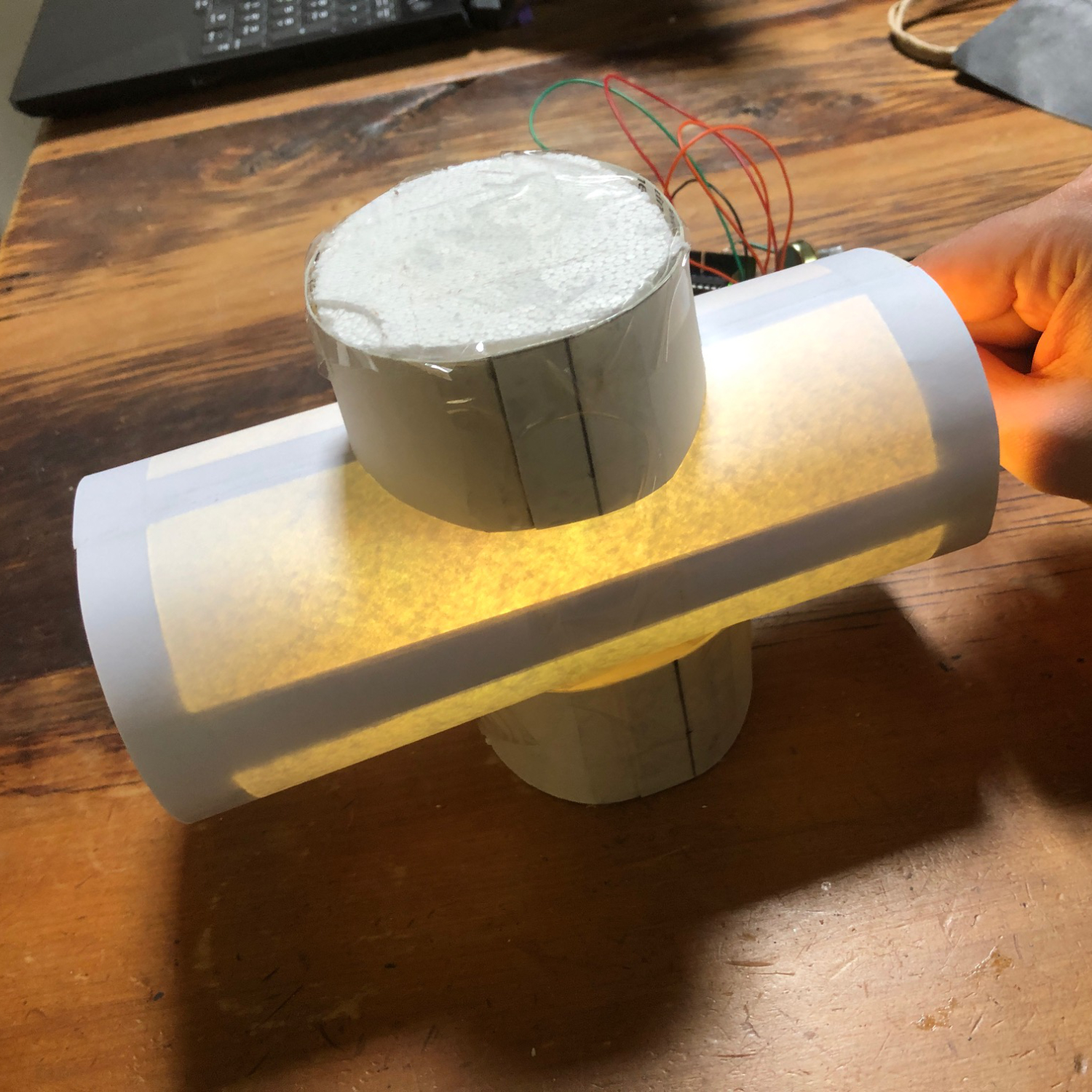
The design process combined digital modelling, fabrication experiments and iterative physical prototyping. Testing different print settings helped improve the clarity of the translucent shade, while adjustments to the structure and controls refined the lamp's usability and overall finish.
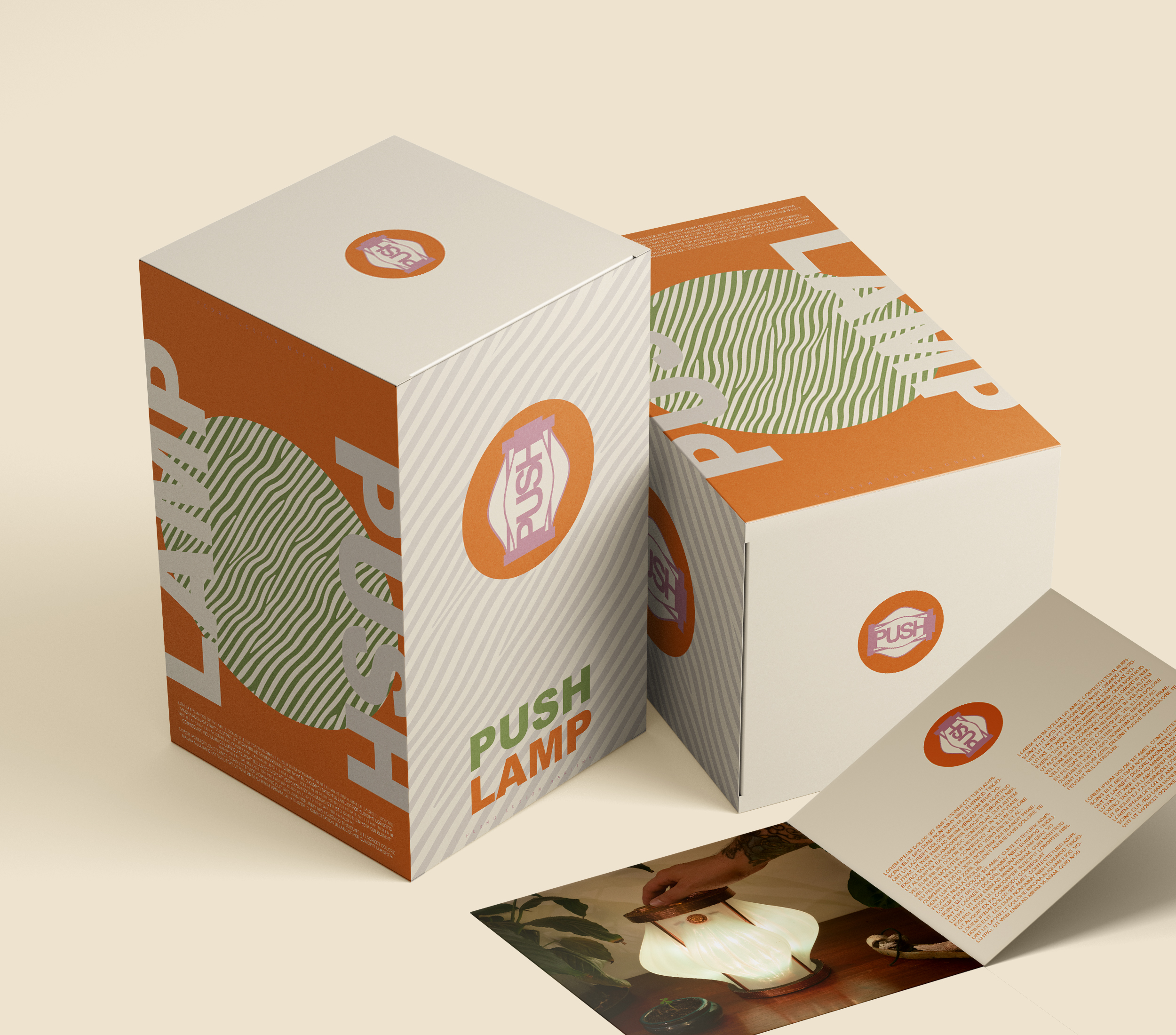
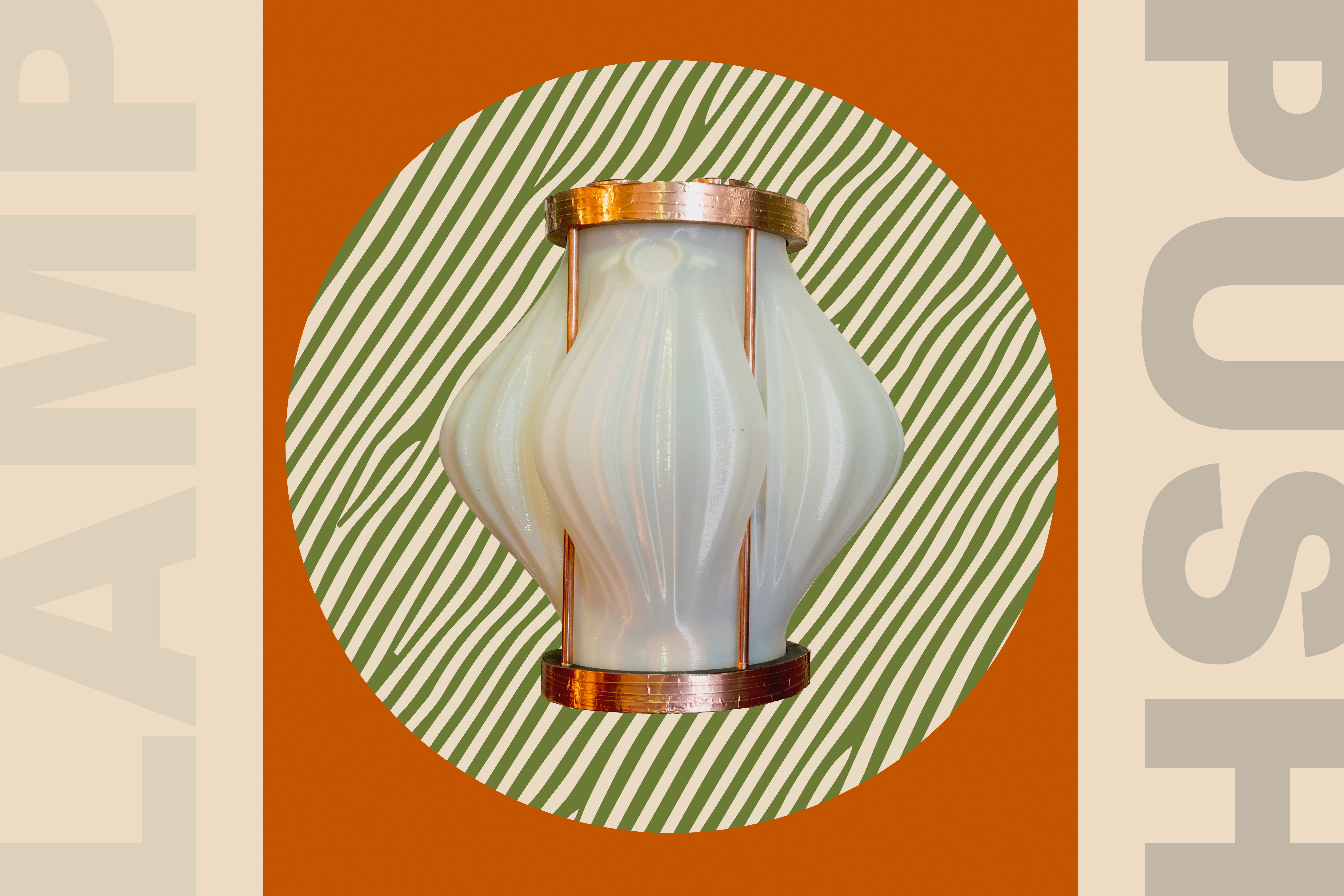
Following the product development, I created a visual identity and packaging system inspired by the lamp itself. The PUSH name refers to the way the shade appears to push through the surrounding structure. Rather than treating the logo as a separate graphic, I developed it around the product's form and integrated the shade's striped pattern into the packaging.
The colour palette combines off-white, pink, orange and green, referencing the shade, copper-inspired finish and dynamic colours produced by the light. This approach creates a consistent visual language across the product, branding and packaging.
Following the product development, I created a visual identity and packaging system inspired by the lamp itself. The PUSH name refers to the way the shade appears to push through the surrounding structure. Rather than treating the logo as a separate graphic, I developed it around the product's form and integrated the shade's striped pattern into the packaging.
The colour palette combines off-white, pink, orange and green, referencing the shade, copper-inspired finish and dynamic colours produced by the light. This approach creates a consistent visual language across the product, branding and packaging.
FINAL WORK